Insights
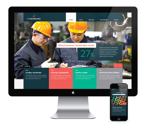
SP Sourcing offers proven expertise, visionary thinking and an ethical outlook to generate prosperity and sustainable value for all stakeholders in the supply chain. VGROUP were approached to develop their brand in line with the four key areas of expertise:- Global Sourcing, Ethical Leadership, Supply Chain & Supplier Development.

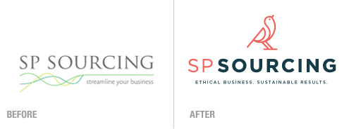
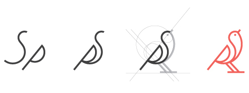
We created a new logo, strapline and visual identity, with special emphasis on the development of a meaningful icon that would communicate the values and personality of the brand. During the early stages of brainstorming, a correlation between SP Sourcings’ Brand truths and the behavioural nature of a bird became clear. The icon was constructed using the SP letterforms to include an upward angle that emphasises the positive service that SP Sourcing provide.

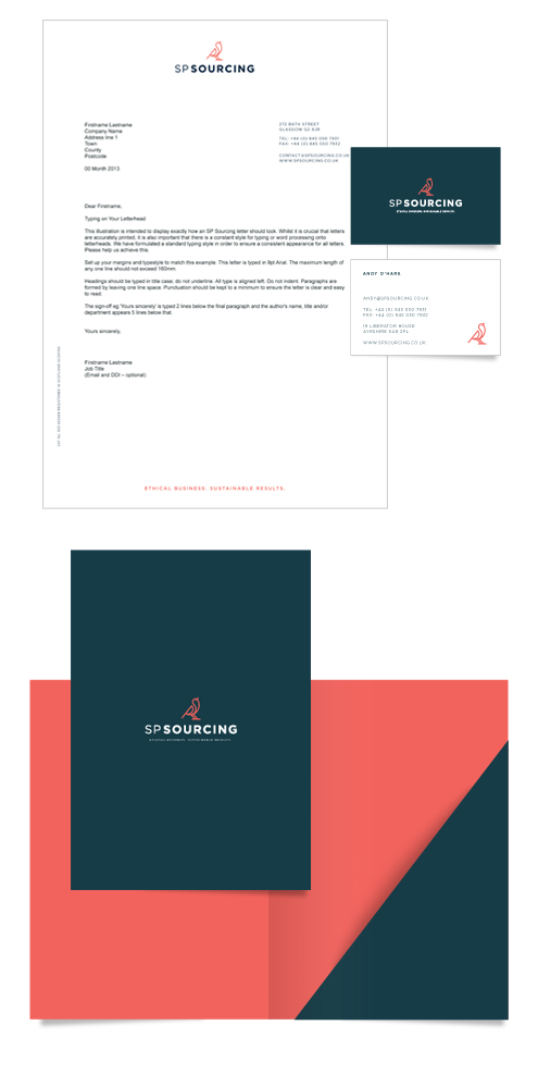
After research on SP Sourcings’ competitors, we devised a primary colour palette of dark blue and coral. These colours convey a professional edge with a warmth that communicates the ethical nature of their business. Aqua and grey were chosen as the secondary palette, injecting the assertive, visionary and technological aspect of their brand values and personality.

