Insights

VGROUP were asked to refresh Bank Partners’ visual identity and to align it to its vision to be the UK’s market-leading independent provider of NHS staff bank management and outsourced staffing solutions.
We began by identifying their vision, mission, values, and core insight. Key messaging was developed and a brand language guide followed which was then supported with website and brand design guidelines.
Bank Partners is the name for the staff bank management division of Pulse, so it was important to retain a visual link through the logotype. However, a striking visual identity using icons and contemporary colours now gives the brand a distinctive and unique personality; open, friendly and professional with a human quality to capture three key elements of the brand – Efficiency, Savings and People.

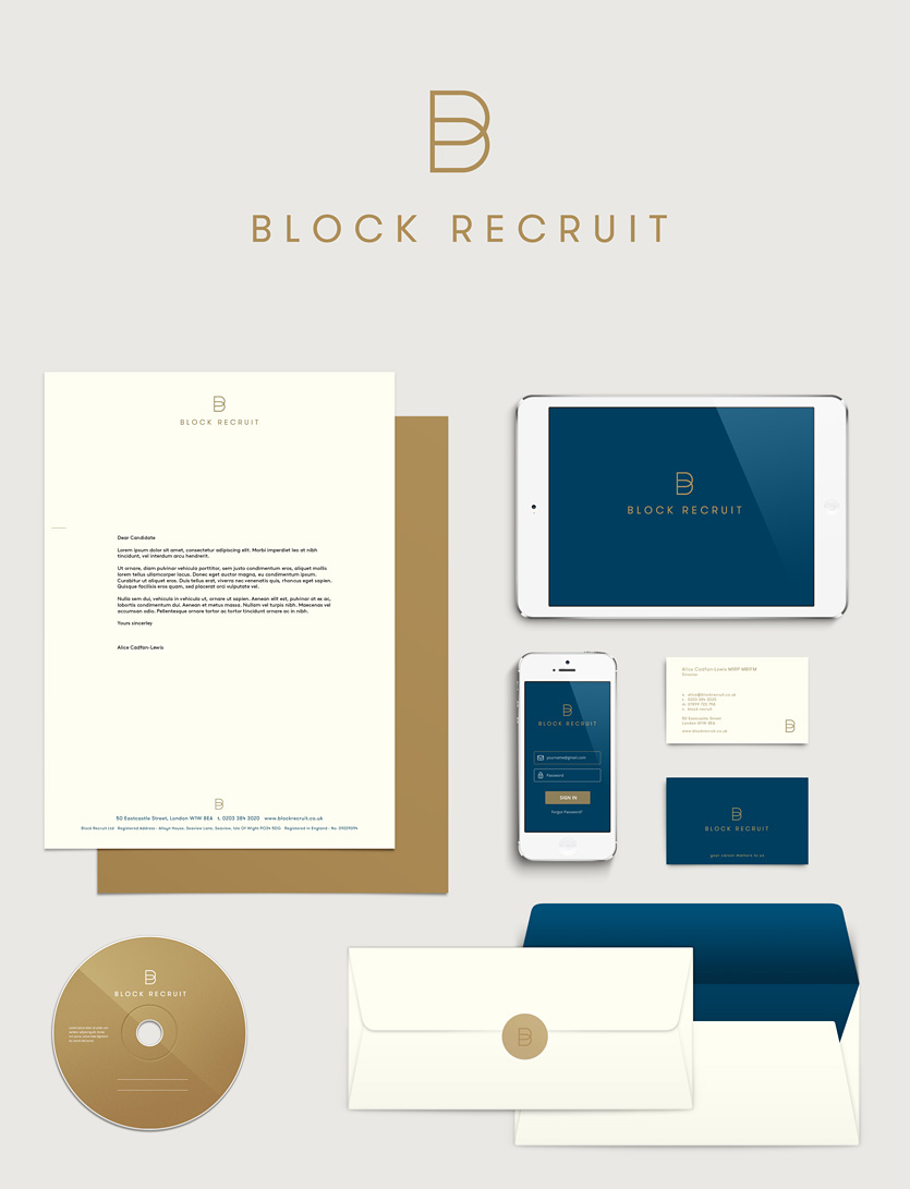
Block Recruit is a new, specialist recruitment company working within the Block Management industry. They continuously source, headhunt and talent spot to find the best candidates for their clients taking a personal interest in their careers as well as promoting their client’s brands. The straplines “Your career matters to us” and “Promoting your brand to top talent” encapsulate their personal approach and quality offer.
Our initial brand positioning work ensured alignment of their visual identity to their key values – traditional with a classic, open and honest professionalism. A dark blue and gold colour palette was selected and a simple, sophisticated symbol designed using a ‘B’ to hint at block buildings and to support a logotype for the name that is down to earth and clear.
Their brand identity is the first step to enable Block Recruit to build on its reputation and project professionalism to everyone who comes into contact with the company.

Pulse, a leading UK and international provider of health and social care staffing and solutions appointed VGROUP to define, articulate and communicate their brand and bring it into the 21st century… here’s their story.
Established in 1987, Pulse now has over 5000 people working for them every day. They had a lacklustre and dated identity, a complex brand structure with inconsistent communications and an undefined tone of voice.
Through research with key stakeholders, we first established a clear vision and mission. We then defined their values, brand promise and core insight which in turn guided the strapline ‘People Perfectly Placed’ as well as the redesign of their logo, visual identity and communications.
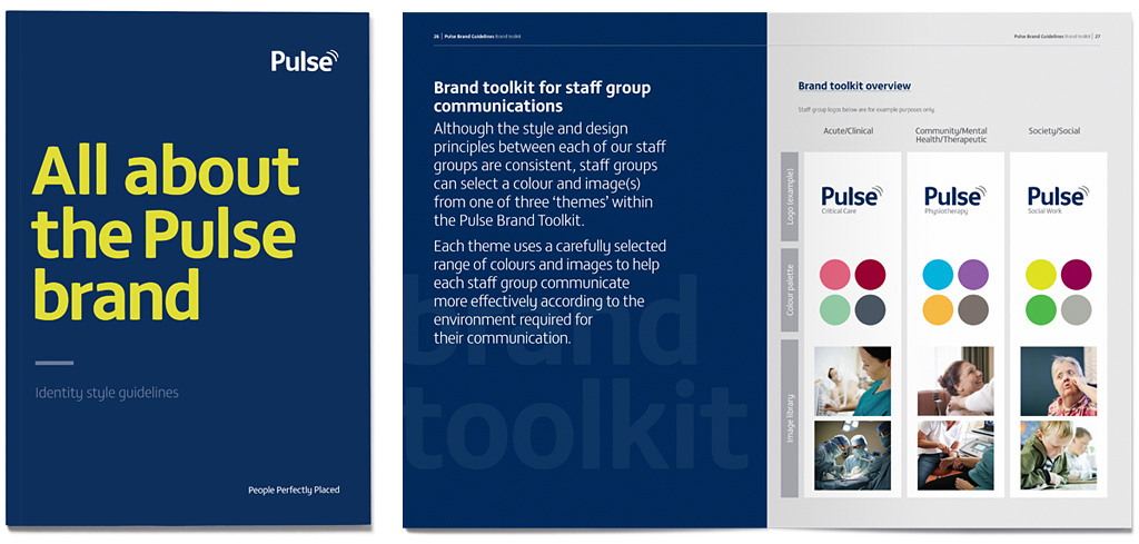
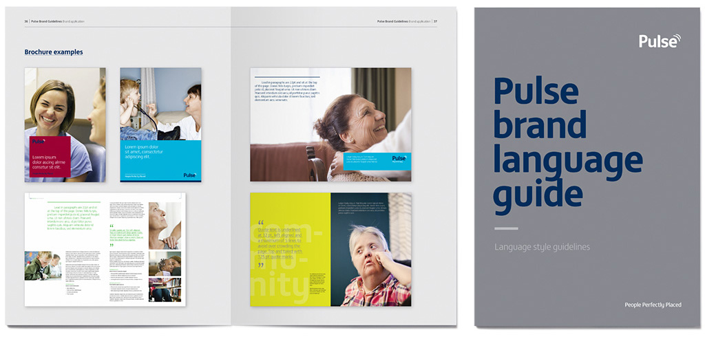
With a comprehensive style guide to use, Pulse are now able to consistently project their true brand values with warmth, compassion and clarity, helping to help set them apart in a competitive sector and guide the design of ongoing marketing collateral.

Following a lengthy tender process reviewing many creative agencies we chose VGROUP as the agency to rebrand our Pulse staffing business. We work in a fast paced industry with a fairly complex brand structures. The team at VGROUP helped simplify our messaging, and develop a brand strategy that facilitates quick and easy expansion into new niche markets. The final brand guidelines have been incredibly well received, both internally and externally, and have assisted with engaging our many audiences. We are now working with them to rebrand two more of our businesses.
Samantha Proctor
Group Commercial Marketing Manager
ICS Group

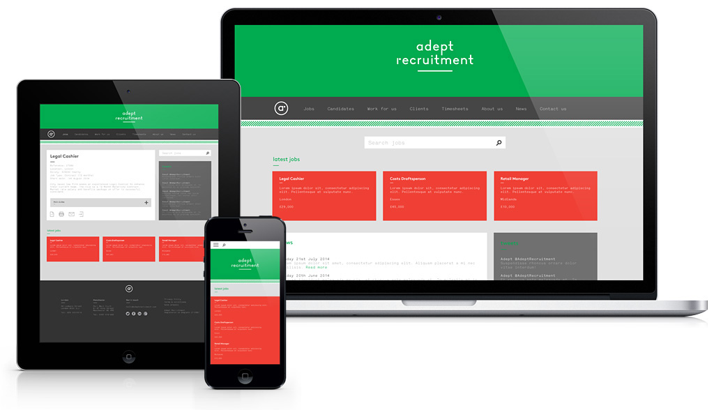
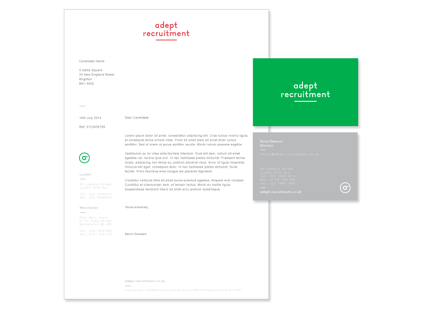
After 20 years of successful trading, Adept Recruitment realised their brand was looking old fashioned. It no longer reflected what they did, or how well they did it. It was time to change.
In a busy, diverse and competitive landscape, creating a difference in the recruitment sector is essential. Our competitor research revealed clichéd stock imagery and information overload. We took a disarmingly simple and direct approach to align Adept’s new logo and visual identity with its core values and brand personality.
The new identity is now integrated across all communications including a new website which has set the bar higher for its competitors and as all progressive brands should do, it is leading the way for others to follow.
