Insights
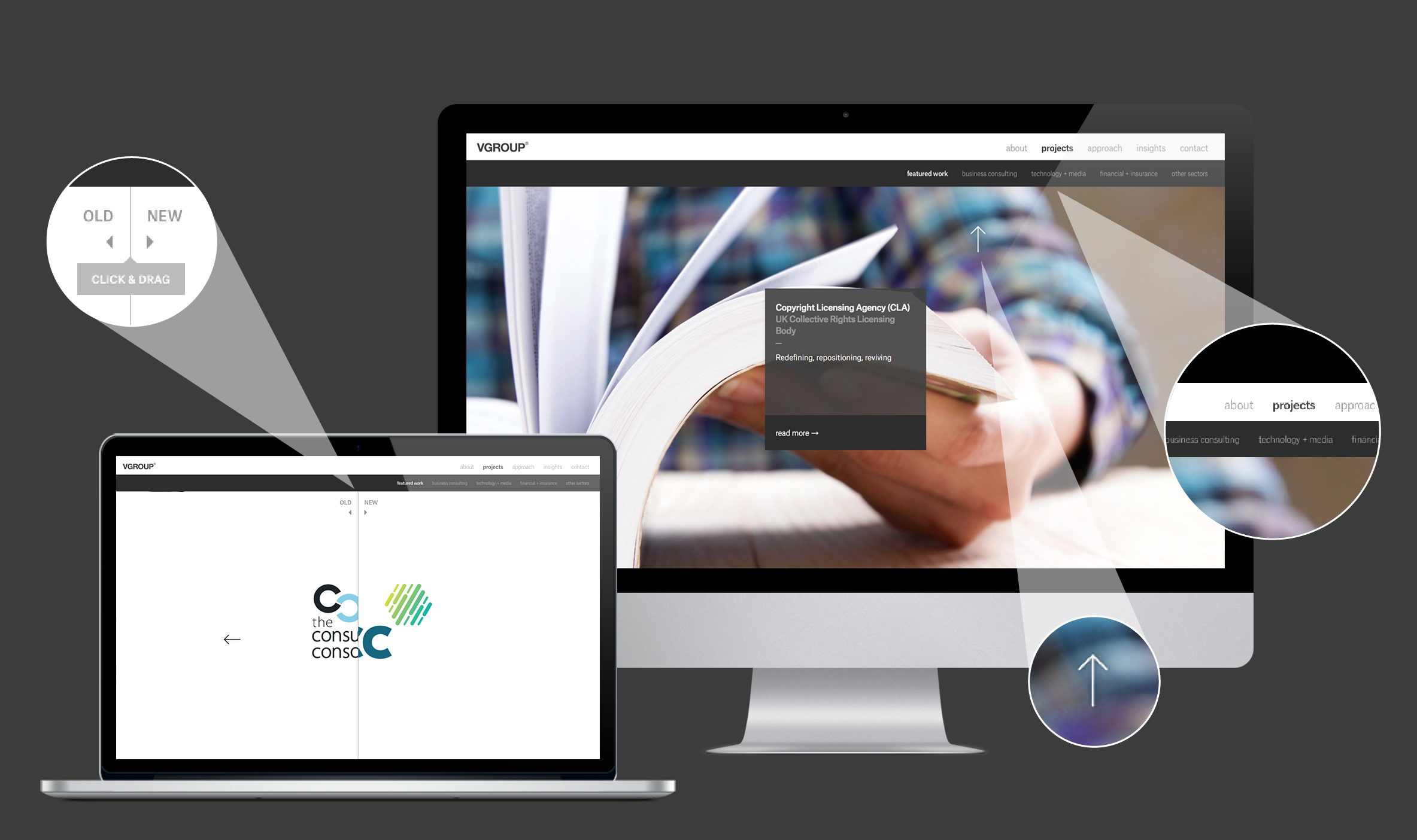
It’s the worst job for any agency but here it is – our new revamped website. Slicker, technically the bee’s knees and a showcase of brands we’ve created or regenerated. It works great on mobiles, is easy to upload new work and we’re happy bees – although the sting in the tail was how long it took – sound familiar creatives?

The refreshed website showcases a brand new homepage, outlining VGROUP’s focus on aligning brand strategy, design and communications. An overhaul on the existing portfolio section consists of an introduction to client sectors and clearer navigation throughout. All in all, we hope the outcome is a more enjoyable user experience that makes every client project special.
Check it out for yourself at vgroup.com
Stelfox are an Executive Search consultancy focusing solely within global Life Sciences. They are committed to providing solutions and creating opportunities through innovation and collaboration.
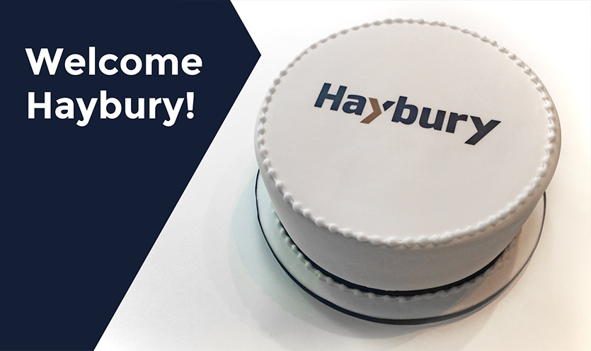
Following their Queen’s Award for Enterprise and a recent brand review by VGROUP, they decided to change their name from Stelfox to Haybury using our NameTag™ framework. We helped them select a name they felt comfortable with and reflected their culture and values. We then updated their logo, evolved their familiar ‘arrow’ identity and aligned key brand messaging to their strategic ambitions, namely; a focus on quality, global expansion, sector specialisms, personalised service and an ethos of empowering development.
To celebrate the launch of the new brand and this exciting phase of expansion we delivered to their office a little surprise on the launch day that we’re told went down rather well…
For those of you that are brand believers (join the club), it’s helpful to have some ideas, thoughts and a voice that can validate and support the principles behind developing your brand. This ACUMEN paper explores the role of brand guidelines in brand development and how they haven’t caught up with technology.
Download – Brand Guidelines: finding the one good reason
Advanced Cancer Diagnostics mission is to make available, to as wide an audience as possible in the UK and Ireland, Chronix Biomedical’s cancer diagnostics technology. Following a recommendation from a long-standing client, they approached us to develop a new brand identity to reflect their belief that their breakthrough technology using DNA testing, will lead to better patient outcomes.
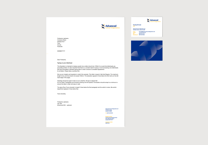
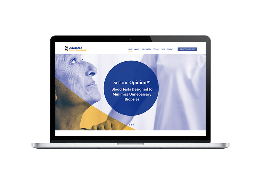
The logo reflects the well-recognised DNA symbol with a modern twist which has been used as an engaging pattern. The symbol has been combined with a timeless logotype and applied across stationery, literature and website design concepts.
The result has enabled ACD to pioneer the Chronix Biomedical’s cancer diagnostics technology and present a highly professional image to doctors, professors and oncologist within the NHS, PMI sector, high-end corporate and middle to high net worth private sector.
